


Breaking down the Wall : Roger Waters Live
It is a truth universally acknowledged, that - your music taste has surely been influenced by a role model in your life. Whether it be your mum, dad, older sibling or cool babysitter. There is no way you came by the Thompson Twins on your own. At least this is true in my life - I didn't wake up one day and realise 'I simply must listen to Pink Floyd', the need to blast Comfortably Numb in the car with my younger sister didn't come from our healthy curiosity in music, nor an accidental discovery on the radio. No, an appreciation for music of that calibre, for a band that was so far ahead of its time, that can only come from someone who was there when it all began - in this instance, my dad.
Following a family outing in mid-2017 to the Victoria and Albert Museum in London to see 'Pink Floyd: The Mortal Remains', it just so happened that Roger Waters was headed to Australia - and so the Roux's were to continue this fan-fuelled journey, and see the inimitable 'Roger Waters: Us and Them' live in early 2018. And Roge' did not disappoint.

At first, I won't deny that I was disappointed. Of course I went for the music, but with very high expectation as to the stage design. Upon entry, all I could spy was a large cyclorama behind the band - 'standard', I thought. The show was split into two 'acts' if you will - and act one was a staggering display of strapping visuals relevant to contemporary issues and events (refugee crisis, war, the works). Of course the music was mind-blowing, in terms of quality, it is still timeless and incredibly prodigious in it's performance. The graphics displayed throughout the act allowed for there to be a constant relationship between the visual and audio, engaging the audience fully and never allowing for a moment of distraction.

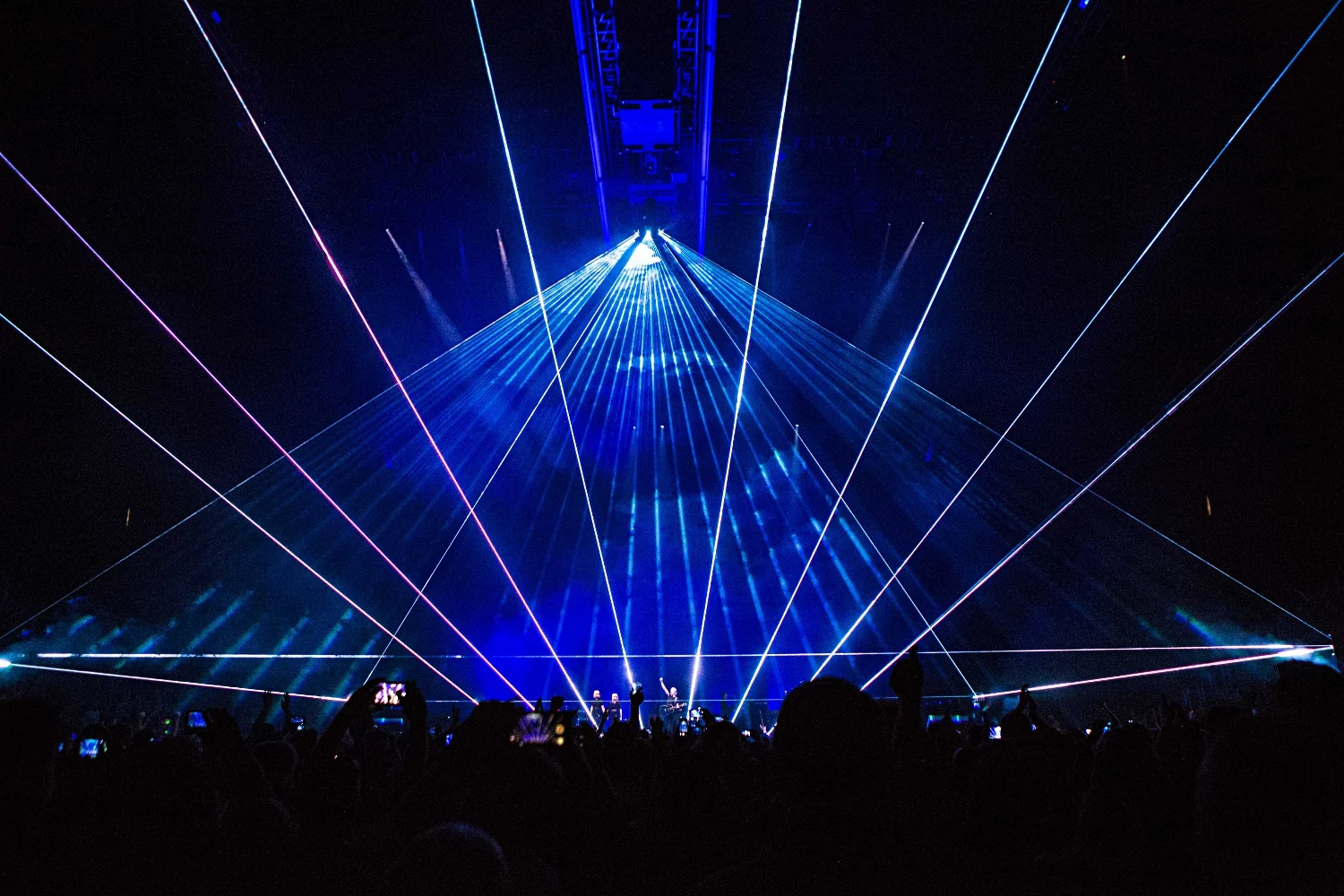
However what I really want to get to is of course, act two. After a brief intermission, we're back in our seats expecting a continuation of the first hour's cinematic exhibition. However what follows is quite the contrary. The sound of sirens split through the arena as flashing red lights are emitted from what had seemed like structural frames from above. Slowly, the supposed 'warning lights' start to descend down into an audience, their excitement now very much piqued. What followed was a spectacular show. From these structural bars, now about 20 meters above audience heads, a factory emerges. The bar expands and grows into the industrial menace Pink Floyd spent years singing and writing about, a factory of mindless pigs upon which visuals concerning the infamous Mr Trump are projected. Don't believe me? See for yourself:

The sheer scale of this - well, additional stage really - is enough to push the show into another realm. What's more, is Waters' fearless attitude towards freedom of speech if you will. As the song 'Charade' starts to play, the visuals of Trump continue and grow into a ridicule of the man. Trump as pig, Trump as baby, Trump as a statue of David with rather miniscule...genitals. Furthermore, images of Trump and Putin start to play, the boys shaking hands, playing with guns, playing with their friend Mr Kim Jong Un.

To further support this violent message against Trump, the following song projects very simply quotes from Trump's various speeches and promises, and seeing them almost 'out of context' like that highlights and emphasises the sheer stupidity and well, audacity of this man. Pink Floyd has never been shy when it comes to commentary, whether it be political, economic, environmental or social- 'Another brick in the Wall' being a prime example, banned in many countries including South Africa where my parents grew up (perhaps an incentive for the love my dad has for the band) - and Waters' has made it evident that he is still a firm believer in commentary through this show, as there is no limit. If there was, he continues to push it as the final cinematic roll of the song projects the words 'TRUMP IS A PIG' over all screens. About as subtle as a chainsaw, I'd say.

I thought this was the peak - surely the show has lived up to all the reputations associated with it? But then that wouldn't be very Floyd-ian, would it. No, the final easter egg was in the arena all along - an inflatable, silver ball had been casually drifting around the arena all night, cool at the start but easily forgotten once the rest took off. However the composition came together in the final 'scenes' of the show as almost out of nowhere, projectors hidden in the audience shoot out beams of light that form a prism, evident thanks to the smoke-machines. From the top of the all too familiar Dark Side of the Moon light prism, comes rays of spectral lights and in what can only be described as a majestic moment - the album cover you saw in your dad's record box when you were 10, has become a tangible visual display floating in space above thousands of people who I guarantee, were close to tears of joy.
You can't help but feel poetic after such an experience, words like 'transcendental' float around in your head and finally, you can make sense of lyrics that had always been beautiful, but not fully comprehensible.
'We're just two lost souls swimming in a fish bowl, year after year.'

Clips from the Barber Shop Chronicles
I was born and raised in Cape Town, South Africa. When I was 17 years old, we relocated to Australia and I haven't been back in 3 years - until now.
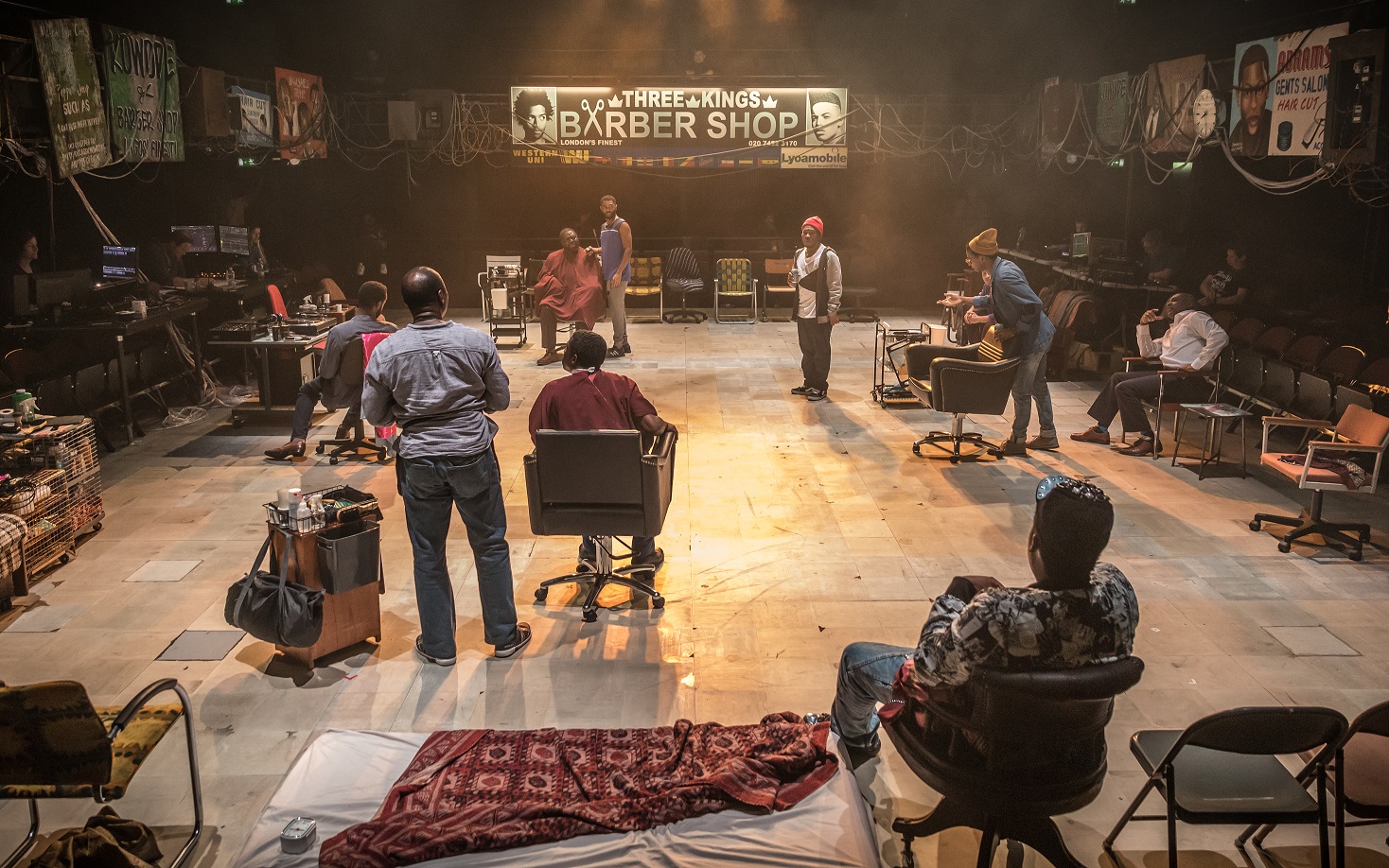
The Barber Shop Chronicles made it's way from The National Theatre in London to Perth International Arts Festival this summer, and graced The University of Western Australia's Octagon Theatre with it's colourful presence. Written by Inua Ellams, directed by Bijan Sheibani and designed by Rae Smith, this journey across six cities tells stories of cultural similarities across borders and the strength of the relationship between a father and son, passed down from generation to generation.
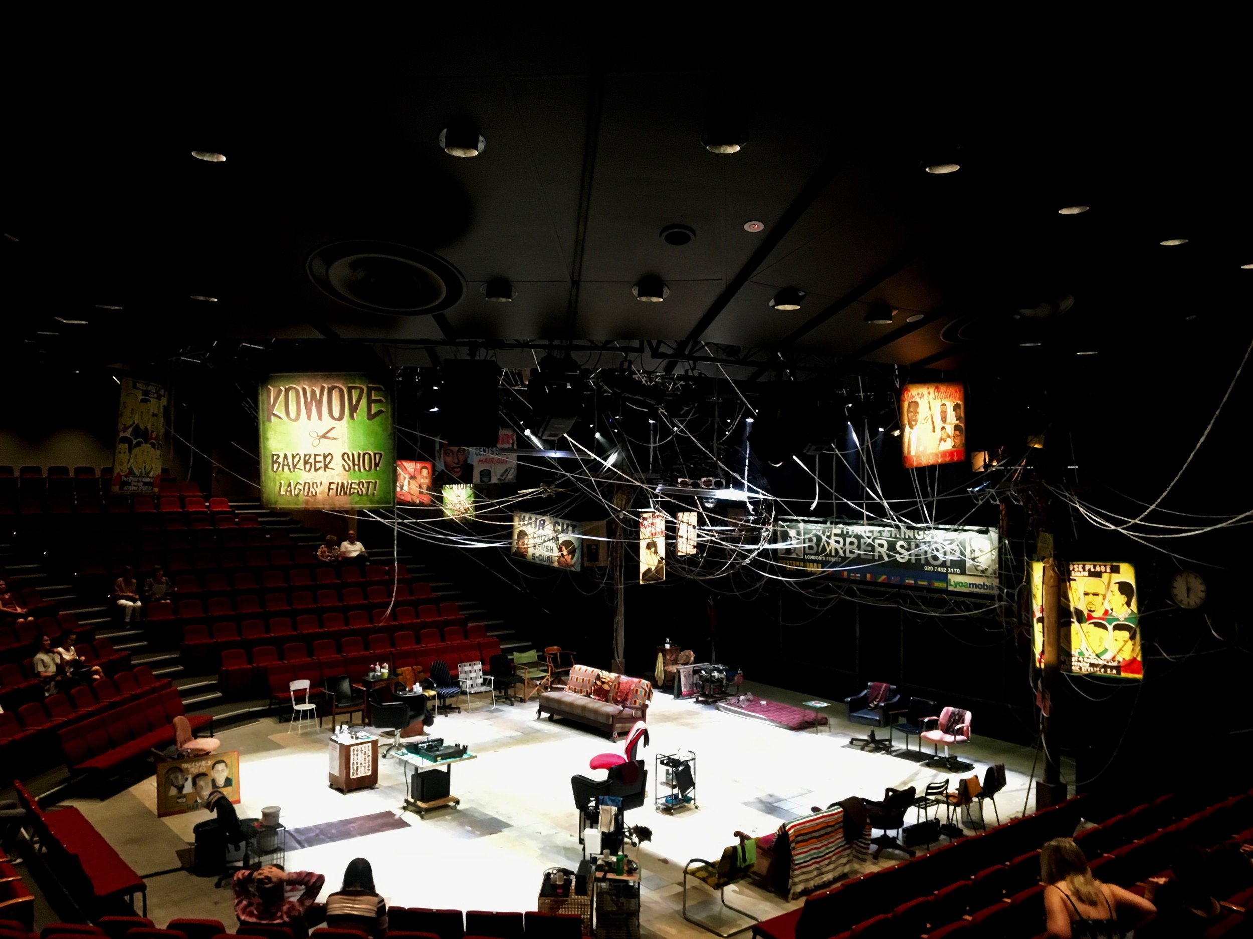
Stepping into the space, I was immediately transported back to days of driving through down town South African cities, where telephone wiring strung across streets is as abundant as fairy lights in Debenhams around Christmas time. These act as links to the various Barber Shop 'Billboards' if you will - a series of signs from Barber Shops across Africa and the UK are placed above the stage and when we enter the location of each of those, the billboard is illuminated. Transitions are also further indicated through a large wire framed globe, suspended from the ceiling. As the scene changes, the wired globe lights up highlighting the different relevant continents, creating a relationship between the large scale scenes and the smaller intimate scenes.
The set is comprised of a series of barber chairs and tables on wheels, incorporated into the choreography of the dances that take place in the various scene and location changes. The eclectic selection of furniture doesn't add to an overall chosen or 'designed' palette, together they create a feeling of diversity and scale - relevant to the thematic contents of the play. However in the setting of each separate barber shop, these furniture pieces make sense and give a sense of place, whether it be related to monetary or cultural elements. The central location for the story to unfold is set in Peckham, South-East London. Here we see the largest, most prominent billboard set against a fenced wall, indicating the socio-economic context of the shop. The other barber shops flow in and out of this location, set apart by identifying elements and characters such as a power-generator in Lagos or a drunken father in Johannesburg. The fluid nature of the set enforces the story as the blur between country and culture is equally as variable therein.
The warmth created through not only the storytelling and superb acting, but also through the welcoming and familiar set design was evident in the audience participation throughout the show, clapping to the beat as actors danced, marked very clearly by the standing ovation at the end.
I made an appointment at my hair salon shortly after.

Designing the Didascaliae
How often do we take magnificent pieces of performance art for granted?
Yes, quite often, right you are.
Ever considered how often we take the reality of it for granted? The reality being, what allows us to place ourselves in the world of those performing?
I bet you haven’t, not really anyway.
It goes without saying that no production goes without its problems, whether it be theatre, film or a live performance. The shred of light often being the clever art of improvisation by the performer, whatever it may be. However there is only so much that can be done once the environment is set. See, where performance allows for improvisation on the spot, improvisation or rather innovation, when it comes to the design of the space, well that’s step one. The very first thing a designer sits down with, is the impossible that the director or artist has asked. Problems get them going.
At least some own up to it.
“It was very f—ing difficult to do but we had some very good people on board who made it happen.”
- Roger Waters, The Wall (1980) [7]
And this is most definitely not a new thought in design – it applies to any form of it. Architects design based off potential problems, they almost create them just to solve them. Graphic designers ask how information will not be communicated, and then design away from that. The only designers that seem to want to keep the problems are those who design golf courses because well, that’s how you ruin a nice walk. Golf.
I digress.
Let’s start with theatre.

Image via Culturetrip [2]
The designer along with the director starts by interpreting the didascaliae of the narrative, reading into both what the playwright intended or what they might have intended. Most playwrights know there are certain conventions to follow when it comes to stage directions, they have an understanding of the theatre and they know what is possible, some merely suggest at things and like to leave it up to the designer and director to make the piece come to life in whatever way they seem fit. Others have preferences, and it is evident that they wrote the piece with a certain aesthetic in mind – respectfully those directions are followed.
So what about pieces like ‘Cleansed’ by Sarah Kane, where a field of daffodils arise from the floor and a man’s tongue and hands are cut off?
Playwright and academic Dan Rebellato states: ‘Cleansed is a very, very difficult play on a page. It’s full of what appear to be almost impossible stage directions.’ [3]
So why was it written in this manner and how do set designers approach it?
To answer the first question, playwright Simon Stephens puts it quite cleverly
“ … a commitment to intelligence in the rehearsal room. In my opinion what Sarah was always keen to engender, was a rehearsal room where actors were having to be thinkers, and were having to bring their imagination and their intelligence to the rehearsal process, rather than prescribing for them, exactly what they should be thinking and doing at any given time. This for me sits underneath the audacity of some of those stage directions in ‘Cleansed’ and what you probably get as a consequence of that is rehearsal rooms where actors are at the top of their game and great productions” [3]
And this most definitely translates into the design process as well. Just because a playwright doesn’t provide solutions, it doesn’t mean it’s unstageable, it just means you have to be clever when it comes to solving them. Over the years there have many interpretations of Kane’s ‘Cleansed’, often not literal. However in 2016, The National Theatre put on what was to be a very literal display of this piece. Under the direction of Katie Mitchell, all that which was deemed ‘unstageable’ was made to come alive.
Set designer Alex Eales explains the approach, claiming that the architecture of the space was based off the classical rules of composition. Decisions were made based off that, and one can see how the horrors that occur on stage have a somewhat biblical resemblance when it comes to the almost ‘painterly’ images they create. Slowly, the audience is informed of the time and place in which the piece takes place.
So they approached it compositionally, recreating familiar scenes in human history, as one would in a film. Which is exactly what Ridley Scott did in ‘Blade Runner’ (1982). It’s easy to assume that in film there can be no difficulties when it comes to the design of the space because surely, it’s all possible? Technically, yes. But creating the exact vision in mind, at the precise time with the right people? Still possible, just very nearly not.
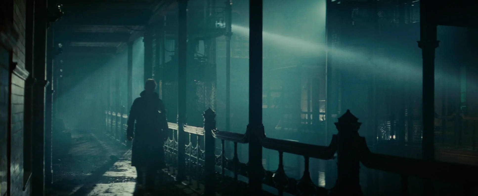
Image via Screenhead [6]
Here’s the challenge: How do you create the future in the present, without alienating your audience but rather, captivating them?
“When it comes to science fiction, the devil is in the details”
- Ridley Scott. [6]
I can’t go into too much detail as I have a word limit you see, however, one example should do the trick: The iconic Bradbury Building, used in many a film from as early as the 1940’s. When Scott mentioned wanting to use this Los Angeles landmark, producers raised concern, claiming that it has been overused and wouldn’t benefit the mise-en-scene of the film. He responded by saying that it won’t be a cliché, not the way he’s going to do it. Now, you can’t exactly shut the Bradbury down, which meant the production team had only the night time to set up, film and clean before it reopened the next morning. This meant that in 10 hours they had to create a decaying, futuristic space with a sort-of constant water flow all around. Difficult as it may have been, this is clever design. In using such a multi-faceted building Scott was able to frame scenes whichever way he pleased, there is room for great movement and the play with light is made capable by the large glass roof structure. He took the original Bradbury and provided an alternative, something completely re-imagined and new.
Similar to the Kane play, the familiar was used and altered to allow the audience to comprehend yet not fully expect, what was occurring visually or where they were placed in relation to the actors' environment.
There is another instance where an existing architectural structure has been repurposed and reinvented, however instead of changing the central message provided by the space, it was used to strengthen the artist’s views.

Image via Cravenhermit [8]
In 1980 Roger Waters asked to slowly disappear behind The Berlin Wall as it got built up throughout a Pink Floyd live concert, resulting in a performance that would essentially end with a blind audience and a bang - but that wasn’t the challenge. No, the real test was assembling, running and taking down the show, as it involved 420 cardboard bricks that would create The Wall, whilst an animation by Gerald Scarfe would be projected onto it, only to come crashing down with the bricks at the finale. Waters claimed the concept of the band being unseen by the audience would reflect that main character’s alienation from society, but this reflection meant that it couldn’t really be a touring show. The sheer amount of light and stage operators, as well as 'wall builders' meant that there was a lot more going on during the show, instead of just before and after. They even needed a special stage for the building of the wall, a sort of structural bracing piece. This together with all the transportation of it all, meant it added up to be extremely expensive and hardly feasible. However Roger’s claims that it was great to have done it at least once.
So, that’s nice.
These are three examples of many, displaying how the seemingly unstageable was staged. And how? Simply by staying true to the original concepts, not allowing compromise but also drawing from the existing as a base. You see, when you try to realise an idea as literally as possible, those where that is most effective, are the ones that are seemingly impossible to do.
Besides, 'unstageable' is a neologism so therefore; it can’t really exist, can it.
[1] Steinberg, Don. 2015. “Actors and Visual Effects: How to Behave on a Green Screen.” The Wall Street Journal. Dow Jones & Company. June 18. https://www.wsj.com/articles/actors-and-visual-effects-how-to-behave-on-a-green-screen-1434659291.
[2] Koller-Alonso, Paula. "The Most Controversial Plays By Sarah Kane." Culture Trip. March 03, 2016. Accessed November 08, 2017. https://theculturetrip.com/europe/united-kingdom/england/london/articles/the-most-controversial-plays-by-sarah-kane/.
[3] Ntdiscovertheatre. "Sarah Kane: Staging The Unstageable." YouTube. September 05, 2016. Accessed November 08, 2017. https://www.youtube.com/watch?v=O7Z_5JhnkTA.
[4] Eales, Alex. "Let's Talk About Sets: Alex Eales on Cleansed." WhatsOnStage.com. February 19, 2016. Accessed November 08, 2017. http://www.whatsonstage.com/london-theatre/news/lets-talk-about-sets-alex-eales-on-cleansed_39763.html.
[5] O'Neal, Sean. "We visit the Bradbury Building, where the past and future collide in Blade Runner." Music. July 11, 2013. Accessed November 08, 2017. https://music.avclub.com/we-visit-the-bradbury-building-where-the-past-and-futu-1798163368.
[6] "The details of Blade Runner." Screenhead. May 21, 2015. Accessed November 08, 2017. http://www.screenhead.com/details-of-blade-runner/.
[7] Daveliftongmail-com. "How Pink Floyd's Short-Lived Tour for 'The Wall' Reinvented the Rock Concert." Ultimate Classic Rock. February 07, 2015. Accessed November 08, 2017. http://ultimateclassicrock.com/pink-floyd-the-wall-tour/.
[8] "Posts about Pink Floyd on Craven Hermit." Craven Hermit. Accessed November 08, 2017. https://cravenhermit.wordpress.com/tag/pink-floyd/.

From stage right to left: opening The Red Barn doors
The Red Barn ran from October 2016 to January 2017 at The National Theatre in London. Its intensity was so well constructed with such a slow release, that no room for an interval was left and the audience experienced something like never before. And although director Robert Icke managed to perfectly translate David Hare’s adaptation of the 1968 novella “La Main”, by French author Georges Simenon, what really opened eyes, pushed boundaries and closed off conservative theatre, was the dynamic set designed by Bunny Christie.
A is for Aperture – and you can see that is where Christie’s design vocabulary originated. She certainty had the tools for it, as The National Theatre has a side of stage so large, that two whole sets can be present at the same time. So Christie brought to life what was to be a very slow burn, strong narrative that needed to hold the audience’s attention when the story did not ask to. Her solution? Carts the size of the stage, pre-set before they even became visual to the audience, that move on and off as necessary. The clever bit? The scene or ‘cart’ change. Why not mimic the closure of an eye lid, the elimination of light but with sliders that move from stage right and left, up and down, allowing the focus of the audience’s gaze to take on a somewhat cinematic jump. And what energises me most about this dynamic piece is that it’s not as one would assume, automated or operated by technology. It’s raw man power, a 12-person stage crew to be exact, pushing and pulling these loaded carts into place, actors already enclosed within, making sure they hit the mark, night after night.

Image via Bunny Christie
There is an almost dollhouse effect, as actors are able to move between walls and through doors, as if the audience has been exposed to a section cut of the story. This cut in the theatre space allows for more intensity, as there is a subconscious assumption that surely, the audience make out the other half of that space. They are involved in the narrative as they are enclosed in the space with the actors. Thus Christie’s addition of the aperture closure gives the audience a moment of stepping out of the narrative, regrouping, and once again being drawn in the moment the sliders open – revealing a new scene, a new set and a new thread in the storyline.

[2] Image via Bunny Christie
Furthermore, Christie’s play with light is what adds so heavily to what both the director and writer wanted to convey. The mise-en-scene of each scene is integral to the underlying message that is being conveyed to the audience. It gives way at character qualities not always clear, to underlying emotions and to the central theme of masculinity under question. The play progresses through light, from a crepuscular dimness through to a somewhat angelic sharpness. This aligns with the narrative and strengthens the link between the set design and the direction style.
I found it all rather, moving.
Want to know more? Have a look here:
[1][2] “The Red Barn.” Bunny Christie, www.bunnychristie.co.uk/the-red-barn/. Accessed 18 Sept. 2017.

Upstaging Tolstoy
“If you look for perfection, you'll never be content.”
- Leo Tolstoy
Tolstoy was quite right when he wrote that, as you see, I did most definitely not expect or look for the perfection I found when I saw Anna Karenina for the first time.
I remember it very clearly, the impact this film had on me. I’d gone to see it in my final year of school, and upon returning from the cinema that evening, I went straight to my laptop and downloaded the film. I then proceeded to watch it, for the second time in one evening, into the early hours of the morning. I was that taken by the grandeur and sheer brilliance of the set.
I was, quite content.
12 Weeks before they were due to commence filming, director Joe Wright had an idea. What is to stop them from using an old derelict Russian theatre space? After all, Tolstoy’s novel is set in the time period following the Russo-Turkish war, a time where Russia had lost it’s own identity and had adopted that of the French. Thus, the symbolism attached is quite visually striking. All scenes filmed in the theatre, represent the show that Russian culture had become. However, the scenes that take place off-stage represent true Russian culture, still intact.

Image via nickgottschalk [1]
It then became the job of production designer Sarah Greenwood to bring this concept to life. Instead of buying an old Russian theatre however, they took to the empty planes of Shepperton, England, to build their own. And all this with no extra budget.
Some of the most impressive scenes include the horse race. Yes, Wright did in fact request actual horses to be raced inside of the newly built theatre. Or perhaps, the ice rink that had been built inside for Anna to be carted around on.

Image via Pushing Pixels [2]
For a more in–depth analysis, we can look at the main ballroom, the central hub for drama to unfold and tension to build. This is the space where Anna and Vronsky first interact and where the gap between the have and the have-not’s, is most evident. The space is broken up in the same manner as a traditional theatre. Side flats make out the legs that stretch from upstage to downstage, opening up and flowing somewhat seamlessly in to the audience. The décor is true to that of the time, however there were some leniencies when it came to costuming. But that’s another thread to explore.
In the roof of the theatre, a whole other social scene takes place and moving across the grids and between the lighting bars, are the Russian peasants. There is a correlation here, between the theatre crew and the peasants, but not in any way insulting. It is merely to suggest, the cogs of Russian society, those who make it possible for the rich to function (here, connected to the actors) and for the real Russian to come through when the stage doors are opened.
In using one space, and constantly manipulating it to represent another, is a very strong manner of design that takes away from the realism of the set, consequently enriching the performance and keeping the viewers on their toes. It’s Tolstoy on screen.
“All the variety, all the charm, all the beauty of life is made up of light and shadow.”
- Leo Tolstoy
[1] "NICK GOTTSCHALK - ART DIRECTOR." Anna Karenina. Accessed September 14, 2017. http://www.nickgottschalk.com/Selected%20Films/Anna%20Karenina/.
[2] "Pushing Pixels." Pushing Pixels RSS. Accessed September 14, 2017. http://www.pushing-pixels.org/2012/11/15/the-art-and-craft-of-production-design-conversation-with-sarah-greenwood.html.
[3] "Seamus McGarvey BSC ASC / Anna Karenina." British Cinematographer. June 22, 2016. Accessed September 14, 2017. https://britishcinematographer.co.uk/seamus-mcgarvey-bsc-asc-anna-karenina/.

From Citrus to Cedarwood : Staging U2
As you go through life, there are a few scenarios one can create and appreciate for the dreams they are, and accept for the realities they will never become.
But if one of your scenarios happened to be the members of U2 exiting a split open citrus fruit and then continuing to perform their PopMart tour under a giant juicer, well then.
You’re good.
That was 1997. Two decades later, U2 continues to set the live performance trend and push the boundaries, set by them years before. It was a Beautiful Day when at the very impressionable age of 15, I saw U2 perform their 360 Tour at Greenpoint Stadium in Cape Town, and although they did not arrive in a rather large lemon, the cutting-edge claw-like spaceship was a close second.
And then, Even better than the Real thing, they joined forces with set designer Es Devlin, for their Innocence and Experience Tour in 2015. The result?
Well, I can tell you this. It was cooler than Bono’s signature sunglasses.

Image via Billboard [1]
The show will start shortly, we advise you put on your headphones and tune to track I:
The Miracle of Joey Ramone.
A stage lit by only the illuminated screens of mobile phones, a follow spot tracing Bono’s every step, the echo of his voice filled with the promise of the performance to come. And it begins. Suddenly a red wash covers the stage, and an overly large light bulb floats down from above. It’s all about the music, the innocence, the experience. That is the architecture of the current space, but it’s soon to change.

Image via You-Two [2]
You may now proceed to track II: Cedarwood Road
Here, Bono takes a trip down memory lane, and quite literally at that. Flown in is a runway, 37meters long, caged with screens on either side. Bono enters the 'cage' (working on that name) and disguising his voice - a cinematic roll of suburban Dublin, illustrated and collaged with memories past, influential to the band’s identity today.
The screen divides the arena space and creates a central focus line to guide the audience’s gaze. After all, the designer Es Devlin once commented on the democracy of theatre, and I think it applies to live performances as well, claiming that you can’t control the audience’s gaze. You have to fill the void in such a way that everyone is receiving the same experience at the same time. And this is exactly what she has achieved with this stage. There is a visual communication from the ‘e’ shaped rise right through to the ‘i’ inspired runway (representing the eXPERIENCE and iNNOCENCE part of the show), that allows for a constant flow of energy, once again, heightened by the flown in screens.
We advise that you tune into track III: Invisible.
The energy is evident here, where the 'cage' becomes an acid yellow Berlin wall. Graffiti’d across it, words charged with political meaning and social connotations, broken only by the sound-wave glitches that reveal the 4 band members standing within. The 'cage' (you come up with a better name) expands as black cyclorama panels are flown in on either side, bookending the performance space with further projection and visual triggers.
U2 have always had fantastic narratives to their music, and the way Es Devlin has visualised this particular story made it into one of those best sellers that even non-readers read.
But, don’t take my word for it:

[1] "U2's The Edge on HBO's 'Innocence Experience' Paris Concert, Eagles of Death Metal and 'Busting Our Ass' to Finish the New Album." Billboard. Accessed September 07, 2017. http://www.billboard.com/articles/news/7415712/u2-the-edge-hbo-innocence-experience-paris-eagles-of-death-metal.
[2] "Es Devlin On U2's Innocence Experience, Part 2." Es Devlin On U2's Innocence Experience, Part 2 - YOU-TWO.COM. Accessed September 07, 2017. http://www.you-two.com/news/spip.php?article58415.

Juxtaposing the Writings on the Wall
On his first day at Columbia University, Virgil Abloh listened to his head of school explain how only 10% of their current cohort would go on the become architects. His thoughts?
Jokes on you - I don’t want to be one.
What followed was of course, anything but a joke. Abloh went on to finish his degree in architecture, start his own fashion label ‘Off White’ and become the style advisor to perhaps the most self-entitled man in existence – Kanye West. Enough said, I think.
Creating the runway space for a fashion show is far more challenging than meets the eye, but it does help if it’s your own label. Interpreting a concept as subjective as fashion and making it almost objective through manipulating the space in which it is debuted, now that takes some real talent. Which is evident when you consider Off White’s Spring 2018 Men’s collection. Here Abloh does what he does best: juxtapose.

Image via Pitti Imagine [1]
He juxtaposes colour, scale and content in his latest venture, and the effect takes your breath away. A vast cyclorama makes out the background of this runway, on which verse about war and migration is projected vertically. Upon further inspection, one sees that the text is a collage of buildings materials and this adds to the context thereof, as migration and war make up part of Abloh's past and it's this personal connection and vulnerability that makes the show so raw in it's visual style. This is such a contrast from the stunning live performance by the Florence Opera that accompanied the show that the audience is left questioning their own emotional state. This moment of inquisition ties in so eloquently with Abloh’s fashion design, a combination of sharp tailoring and street-wear, that subjectivity no longer seems necessary.

Image via WWD [2]
What makes the projected poetry even more powerful is seeing just how small the models are in comparison. They make their own stand however, as the monochromatic wear is made prominent by bursts of yellow and orange detailing. Playing with scale is a key element in scenic design and often it is the first tool used to alter the audience's perception of what is real. Furthermore, the lighting design draws attention to the models, but just enough so as not to take away from the cinematic displays behind. The darkness that seem to envelope the audience, creates the illusion that the space has no boundaries and there is a sense of timelessness to it.
Abloh set the runway in motion with this:
“I believe in fashion that becomes art.”
- Virgil Abloh
And this is very evident throughout the show. As the music intensifies, the written content on the cyclorama mimics it and suddenly Abloh has managed to not only create fashion that becomes art, but also the exhibition space in which to display it.
For those who are familiar with Abloh’s style, this wouldn’t come as much of a surprise. His ability to create a sharp urban environment by using the sensitivity created through classical music and colouring will always be the contemporary touch that defines his style, one almost questions whether it’s a street-wear label. And why?
Juxtaposition.
Yo, I’d say that's pretty phresh, it’s pretty dope.
[1] "OFF-WHITE c/o VIRGIL ABLOH™ @ Pitti Immagine Uomo 92." OFF-WHITE c/o VIRGIL ABLOH™ - Pitti Immagine. Accessed August 26, 2017. http://www.pittimmagine.com/corporate/fairs/uomo/events/2017/offwhite.html.
[2] http://wwd.com/runway/mens-spring-collections-2018/florence/off-white/review/

The ABC’s: Architecture, Ballet and Calatrava
In June 2010 The New York City Ballet performed 'Mirage' and for your convenience, I propose you picture this:
the progression of limbs trained to a tee, to the composition of complex rhythms and beats.
Now fill a stage with this vision, make it structural and add colour.
Is this your card?

Image via Yellow Trace
"Dance is architecture, and architecture, if it's good, we can say it moves. To me they are very much related."
- Peter Martins
It started with Peter Martins, the Ballet Master in Chief at the New York City Ballet, approaching architect Santiago Calatrava to design for their Architecture of Dance festival. Calatrava was to view their art form through fresh eyes, and often this is most effective in scenic design, as the designer is able to approach movement and space in a completely different way to those exposed to it every day. Calatrava moves from bridges to ballet in this venture, looking to nature for inspiration on how to mimic the beauty and form that is ballet. Working along the ecstatic score of Esa-Pekka Salonon’s Violin Concerto, Calatrava went spherical.
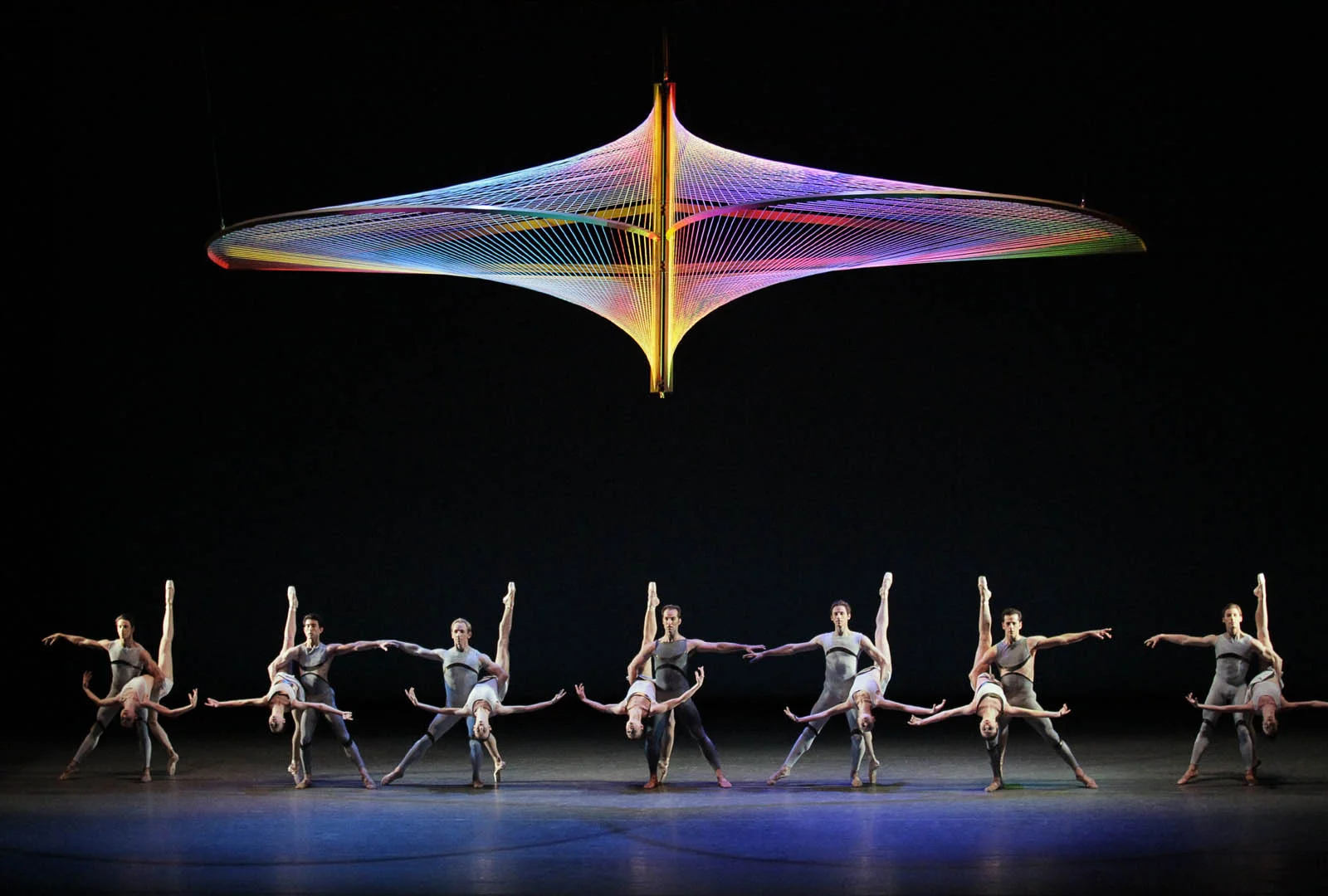
Image via Blue Vertical Studio
The tightly strung arch that occupies the stage was created to dance along with the performers, moving in conjunction with their limber bodies. It's skeleton halves, wholes and morphs completely on stage, absorbing light and producing a range of colours to further the experience. Dancers weave through, behind and in front of it and as they make impact with the floor, the strings vibrate to their beat. This reverberation allows the audience to connect with the movement of the bodies on stage, creating a heartbeat for them to adopt. There is an almost frustrating simplicity to it – you’ll probably hear someone in the foyer afterwards, speaking obnoxiously loud, proclaiming how even they could have done it.
Point is you didn’t, did you.
This isn’t the first nor the last time architects have been asked to collaborate on the ballet stage. In fact, a year later HAAS architects and LINES ballet in San Francisco did just that. An installation was created, a moving set if you will, with which the dancers could interact with on an even more engaging level.
‘Triangle of the Squinches’ took place in 2011 and is a much more independent approach to ballet in contemporary society. This push into the present came about with HAAS architects’ use of everyday ordinary materials to create transformative spaces and surfaces with which dancers could interact. String, cardboard and macaroni noodles - the latter quite obviously a poor joke on my behalf - makes up the base structures of which the performers become part.
Furthermore, the set mimics once again what the bodies have to, the music. Sporadic elemental sounds make up the score and one almost suspects a series of wind chimes to be backstage. The dancers certainly move like one.
Perhaps that is what both these architects aimed to do, create the dream catchers for these nightmarishly stunning performances to get caught up in.

Image via HAAS architecture [4]
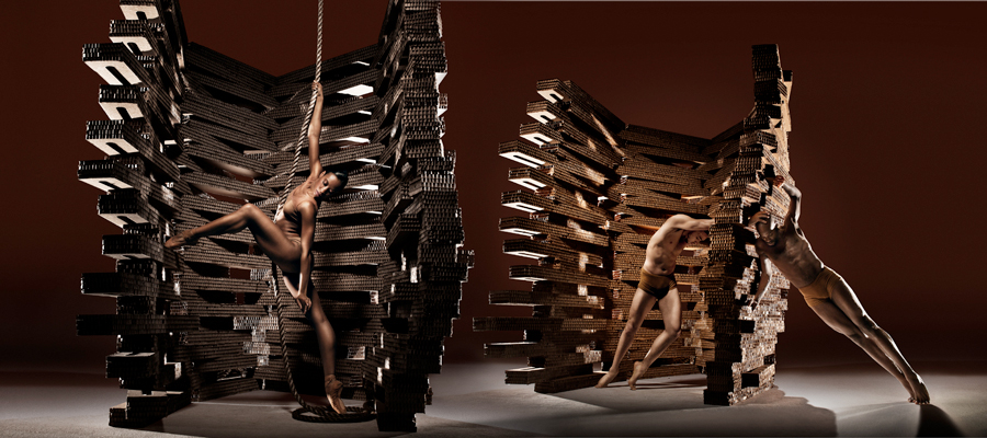
Image via HAAS architecture [5][/caption]
[1] Hughes, Dana Tomić. "Architecture of Dance | Set Design by Santiago Calatrava." Yellowtrace. November 17, 2016. Accessed August 22, 2017. http://www.yellowtrace.com.au/architecture-of-dance-set-design-by-santiago-calatrava/.
[2]https://blueverticalstudio.com/santiago-calatrava-and-new-york-city-ballet/
3]"Janie Taylor Debuts in Millepied’s “Why Am I Not Where You Are” Etc." Tonya Plank. Accessed August 23, 2017. http://www.tonyaplank.com/2010/09/30/janie-taylor-debuts-in-millepieds-why-am-i-not-where-you-are-etc/.
[4][5]"Collaborative ballet." Christopher Haas | HAAS Architecture. Accessed August 23, 2017. http://haas-architecture.com/collaborative-ballet/.

From Libretto to Lights

[1] Image via classical-iconoclast : A Dog's Heart Review
Ever ask a student of design or architecture, why is it that they decided to become an architect? What is it that attracted them to this particular profession? Their response will almost always start with a memory, an experience that stuck with them, brought about through the design of a space. Ask an actor why they chose the theatre, they will recall the first ever piece they saw on stage. A musician will name a song, a fashion designer an item of clothing – the list goes on.
Oh how impressionable we all are.
And really, there is much to be said about creating such spaces and experiences, about having that influence over people. It can only be addictive once mastered. But how about the interpretation of other creative forms, to create influential spaces? Where the creative direction is seemingly set in stone but it’s your job to bring to life the space in which it is to occur, a space in which bodies with purpose and direction will move. Well, that’s the job of a set designer. Whether it be opera, ballet, fashion, music, film or theatre, they bring to life the stories written by others.
And my goodness, have some done a fantastic job.
In 2010, The Dutch National Opera presented ‘A Dog’s Heart’, by Alexander Raskatov (1953). With musical direction from Martyn Brabbins and directed by Simon McBurney of Complicite, the piece was a success and what contributed to this was of course the phenomenal set design by Michael Levine.
The original novel from which it had been adapted was a piece of social commentary by Mikhail Bulgakov, published in 1925 when communism appeared to be weakening in the Soviet Union. There seemed to be reference to communism’s misguided attempt to transform man. And it is clear that in Levine’s set, this element was used to create a transformative space, often unbalanced and tying in with the discomfort the musical score presents. The unpredictable nature of the piece reinforces the tumultuous history and literature behind it, further heightened by the set.
Levine has played with scale, making the ceiling and door height of the central room far higher than natural, emphasising the grandeur of the house in which the conflict takes place. Furthermore, the projection of striking images allows for the back flat to operate as a visual stimulus, reinforcing the actions taking place on stage and working in conjunction, yet sometimes intentionally against, the movement of the singers.
What brought this story to life and into the ‘now’ is the shifting mechanical back flat, allowing for constant metamorphosis on stage as the scenes and times change. Playing with the audience’s perception of what is real and what is a construct, the set piece slowly loses it’s grandeur in the formal sense, and becomes far more intimidating as a mechanical wall to the outside. What Levine does here, by breaking up the space in such a way, is perhaps comment on the social construct that was communism, and the weakened state thereof at the time. As the Opera continues, the set deteriorates and loses its aesthetic quality, much like communism in 1925. He plays with memory and taps into a history rich with conflict, and presents it in a very modern way, subsequently allowing the audience to relate and make connections to happenings in today’s society.
Not only has Levine translated the political context onto the stage, together with McBurney’s direction he’s managed to convey Mikhail Bulgakov’s somewhat satiric writing as well.
Now to me, that’s clever design.

[2] Image via A Dog's Heart | Dutch National Opera & Ballet.
[1] "CLASSICAL ICONOCLAST." ENO A Dog's Heart - Review. November 21, 2010. Accessed August 11, 2017. http://classical-iconoclast.blogspot.com.au/2010/11/eno-dogs-heart-review.html.
[2] "A Dog's Heart Alexander Raskatov (1953)." A Dog's Heart | Dutch National Opera & Ballet. Accessed August 11, 2017. http://www.operaballet.nl/en/opera/2016-2017/show/dogs-heart.